Redefining Payment Plans


My Role & Responsibilities
As the Senior Visual Designer (UX/UI), I led the end-to-end product design process, including research, problem framing, prototyping, visual design, and refining designs through iteration.
Teammate
Content Designer (Tori)
Tools
Figma and Lottie
Background
Late 2023, our business model shifted from charging creditors a fee to charging users a percentage of their settlement. With our launch date approaching and internal restructuring, the design team rapidly redesigned (in 3 weeks) the full user experience based on leadership's product requirements and hypothesized user needs. Through rapid prototyping and internal validation, we introduced the first version of Payment Plans—a flow critical to driving user engagement and generating revenue.
This case study highlights how I applied Design Thinking for ideation and combined it with Build-Measure-Learn methodologies to evolve the Payment Plans flow to better serve both users needs and business goals.
The Results
By redesigning the Payment Plan flow with user needs, flexibility, and trust at the forefront, we reduced abandonment rates and empowered users to confidently navigate their debt settlement journey. This led to a 14% increase in offer submissions post-launch.
The Problem
A few months post-launch of Payment Plans, backend data revealed that 68% of users abandoned the process at the Payment Plan acceptance, a critical point in the user journey. Additionally, 4% of users who did proceed later requested access to plans they had previously declined, highlighting a potential lack of flexibility in the existing flow.
Design Challenge
How might we help users feel more confident and in control when selecting payment plans?
Process Overview
I combined Design Thinking to better understand user needs and Lean Startup methods to quickly validate solutions through iterative feedback. This approach helped solve complex problems with empathy while staying agile and adapting to real-world user behavior.
1. Problem-Solving with Design Thinking
-
Empathize - Reviewed session replays to identify user frustrations.
-
Define - Clarified the core issue as trust and flexibility.
-
Ideate - Explored simplified solutions to give users more control.
2. Execution with Lean Startup
-
Build - Development based on insights from Design Thinking.
-
Measure - Tracked user engagement to see how users interacted with the flow.
-
Learn - Analyzed data from user interactions and feedback to identify areas for improvement and refine the app accordingly.


Research & Insights
Observed Behaviors
Using tools like LogRocket for session replays and reviewing user feedback from support emails, I identified two major patterns:
1. Behavioral Patterns - Users often declined multiple plans before finding one they preferred.
2. User Frustrations - Some users paid for unwanted plans to access the second plan they wanted.
These insights confirmed that a lack of flexibility and transparency in the plan acceptance flow was undermining user trust and contributing to high drop-off.
Connecting Personas to Core Challenges
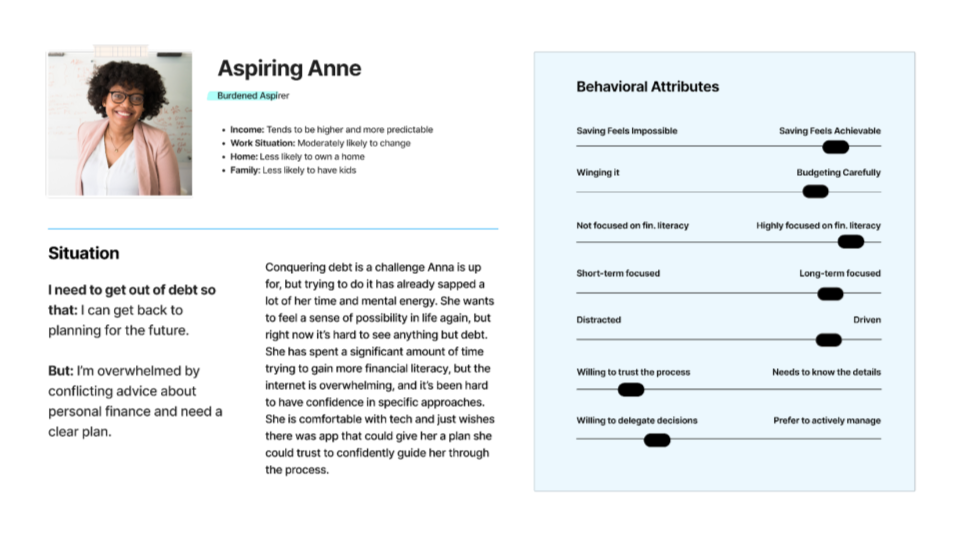
To ground ourselves once again with the users we were serving, I returned to our user personas. I found that the current flow was failing to support the unique needs of two key personas, Stretched Stacey and Cautious Chris:
-
Stretched Stacey with her unpredictable income, needed the ability to compare and select plans that best fit her financial situation. The current flow, which required users to accept or decline each plan one at a time, left her feeling frustrated and unsupported.
-
Cautious Chris needed clear, transparent details about the plans to feel confident in committing. However, the inability to revisit declined plans eroded his trust in the process.


Putting it all together…
So, we have a few problems that our users are facing at reviewing offers. But as one of our users put it:
“I would like the ability to pick and choose all at once.”
— User feedback (email)
From this and other insights, two core problems emerged...
1. Inflexible Options - Users need the freedom to choose payment plans that fit their individual situations.
2. Poor Trust - Users require more reassurance to feel confident navigating and committing to these plans.
Ideation
Where do we go from here?
To inspire a solution, we began exploring examples from other websites and platforms, including competitors.
Realizing that the existing payment plan flow wasn’t meeting users’ needs, we took a step back to rethink the entire experience. Instead of guiding users seamlessly through offer selection, presenting a single payment plan had become a barrier. Where there were inflexible options, we needed to provide choice, and where there was poor trust, we needed to build confidence and reassurance.


Expanding my perspective, I reflected on the processes users described in past research—from their initial desire to tackle debts to selecting a partner and accepting terms. While our core service focuses on debt resolution, the user journey they outlined closely aligned with:
The Consumer Buying Process of E-Commerce
The journey users take with Relief closely mirrors the steps customers follow when making everyday purchases: recognizing a problem, researching options, comparing alternatives, making a selection, and completing the purchase.
To refine this approach, we analyzed top e-commerce platforms, specifically focusing on offers and the shopping journey. This comparison revealed finer details, such as flow and language, that could better guide users through the process. With this logic as our foundation and leadership’s approval, we moved forward to explore solutions.
Ideation 1: Early Flow Explorations
Our first round of designs drew inspiration from the checkout flow, aligning with our focus on creating a more intuitive and familiar experience. Below is the flow we presented to leadership, with three key areas of focus:
1. Simplified Information and Flow
-
Recreated a flow that mirrors the standard process of e-commerce platforms.
-
Reduced the amount of information displayed for each plan, showing only what was certain at that stage.
2. Choice for the Users
-
Introduced checkboxes for plan selection, allowing users to review all plans on a single screen.
-
Added checkboxes on the checkout summary screen, enabling users to “update their cart” as needed.
3. Checkout Summary
-
Designed a clear summary screen listing all accounts selected for reduction and the total cost for those reductions, helping to build trust through transparency.

Leadership Feedback
After reviewing this first round, it was evident they were most excited about a version that incorporated a paywall. They wanted to:
1. Simplify Further - While we interpreted simplicity as focusing on one action per page, leadership wanted fewer pages overall, prompting us to rethink the structure of the flow.
2. Incorporate a Paywall - Leadership saw value in a paywall as a way to emphasize the perceived value of the product and create a more sales-driven experience.
It was clear that the team’s enthusiasm for the paywall stemmed from its ability to make the value proposition more apparent, rather than just providing a straightforward checkout experience. However, we had to adapt this concept as traditional paywalls are typically used in subscription models, which didn’t align with our offering.
Summary Insight for Leadership Buy-In
These explorations helped align leadership on the importance of flexibility and transparency in the payment process, which became core pillars of the final solution.
Ideation 2: Continued Explorations
Based on leadership feedback from the first design review, we needed to refine our approach to better balance user needs and business goals. The focus was on reducing friction, improving clarity, and driving conversions through a more deliberate checkout experience.
Version One: Simplified Flow

✅ Prioritizes speed and ease
✅ Fewer screens to complete the process
❌ Risked reducing user trust
Version Two: Hybrid Checkout Flow

✅ More detailed information per screen
✅ Provides more transparency and trust
❌ Slightly more complex flow
When presenting these designs to leadership, I emphasized the trade-offs of each option. While both versions prioritized quick conversions, Version One’s simplicity came at the cost of building trust, as it limited the amount of information provided to users. In contrast, Version Two fostered trust by providing greater transparency and value, though it introduced slightly more complexity to the flow.
Returning to our user personas, we recognized that adopting the simpler design in Version One could risk neglecting Cautious Chris, who values detailed information to make confident decisions. By providing more information across multiple screens, Version Two not only supported Cautious Chris but also addressed the needs of all three personas, ensuring a more inclusive and user-centered solution.
Key Insight
We moved forward with Version Two (Hybrid Checkout Flow) to ensure users had the clarity and transparency needed to feel confident about their payment plans.
Ideation 3: Detailed Style Explorations

With leadership aligned on the hybrid checkout flow, the team moved on to refining the content and visual design—the most critical phase to build value, excitement, and user trust at the final step of the journey.
Our approach centered around three key areas:
1. Content Clarity
By keeping the content clear and concise, we ensured that users could fully grasp the value of each offer.
2. Trust and Reassurance
Clear summaries of selected plans, the ability to view and compare all available plans at once, and transparent pricing helped users feel confident in their decisions.
3. Visual Design
-
Initial Qualification Screen
-
While we initially considered combining the eligibility screen with the payment estimation and progress tracking, we ultimately prioritized maintaining this as a standalone moment to build confidence and motivate users.
-
-
Account Selection Screen
-
For the account selection step, I explored different layouts and visual styles to help users easily distinguish between recommended accounts and non-recommended accounts. Pricing and totals were prominently displayed, ensuring users understood the financial implications of their choices at a glance.
-
-
Paywall Screen
-
A clear summary of their savings, paired with a guarantee of a refund within 60 days if no reductions were achieved, instilled confidence in the process. To enhance engagement, I integrated a Lottie animation of a paper plane gliding across the screen—a metaphor for the simplicity and ease of the Relief process. This added a sense of clarity and delight, transforming the experience into something more uplifting and approachable.
-
IA & Scope

Final Designs
Checkout Flow

I created a detailed wireflow to give the team a clear view of each flow, design element, and content structure. This tool helped align design and content strategy and provided engineering with a roadmap for smoother implementation and shared understanding.

Refining the Checkout Experience
Reducing Accidental Taps
A few weeks following the launch, 18 users contacted customer support, reporting accidental taps on the CTA at checkout, which led to refund requests.
To address this, I revisited the early research and found inspiration in Amazon's "Swipe to buy with 1-Click" feature. This feature uses a swiping gesture instead of a tap to reduce accidental clicks, offering customers a more intentional interaction. Drawing from this insight, I redesigned our checkout button to include a swipe interaction, ensuring a more deliberate action.
The Results & Learnings
After Paywall Launch - September 2024
While the numbers below highlight a significant increase in user engagement three months after launch, this period overlapped with the start of marketing campaigns and the holiday season, making it challenging to determine total impact of the new checkout flow.
By redesigning the Payment Plan flow with user needs, flexibility, and trust at the forefront, we reduced abandonment rates and empowered users to confidently navigate their debt settlement journey. This led to a ~14% increase in offer submissions post-launch.
~14%
Increase in offer submissions 🚀
We saw a increase in submissions rate from 8% to 20%
~100%
Reduction in checkout miss clicks
Since updating the button tap interaction to a swipe to pay button
Three months before launch
~16k
Total Users
~22k
Offers Generated
~2k
Offers Submitted
Three months after launch
~32k
Total Users
~12k
Offers Generated
~2.5k
Offers Submitted
Learnings and Reflection
This project taught me how to balance user-centered design with rapid iteration in a lean startup environment. By combining Design Thinking with Build-Measure-Learn, I adapted processes to meet changing business goals while keeping user needs at the center.
If I could do it again, I would prioritize early user testing. This would help validate design decisions, uncover more pain points, and refine solutions before implementation. Adding user testing would have made it easier to balance leadership’s focus on conversions and engagement with the user’s need for trust, clarity, and flexibility.